
Moving past the leaf
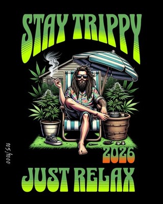
Weed logos were stuck for decades. You know the look: jagged leaves, purple smoke, and rasta stripes. By 2026, that's mostly gone. New brands want to sit on the same shelf as high-end gin or skincare, so they're ditching the head shop aesthetic for something that looks professional.
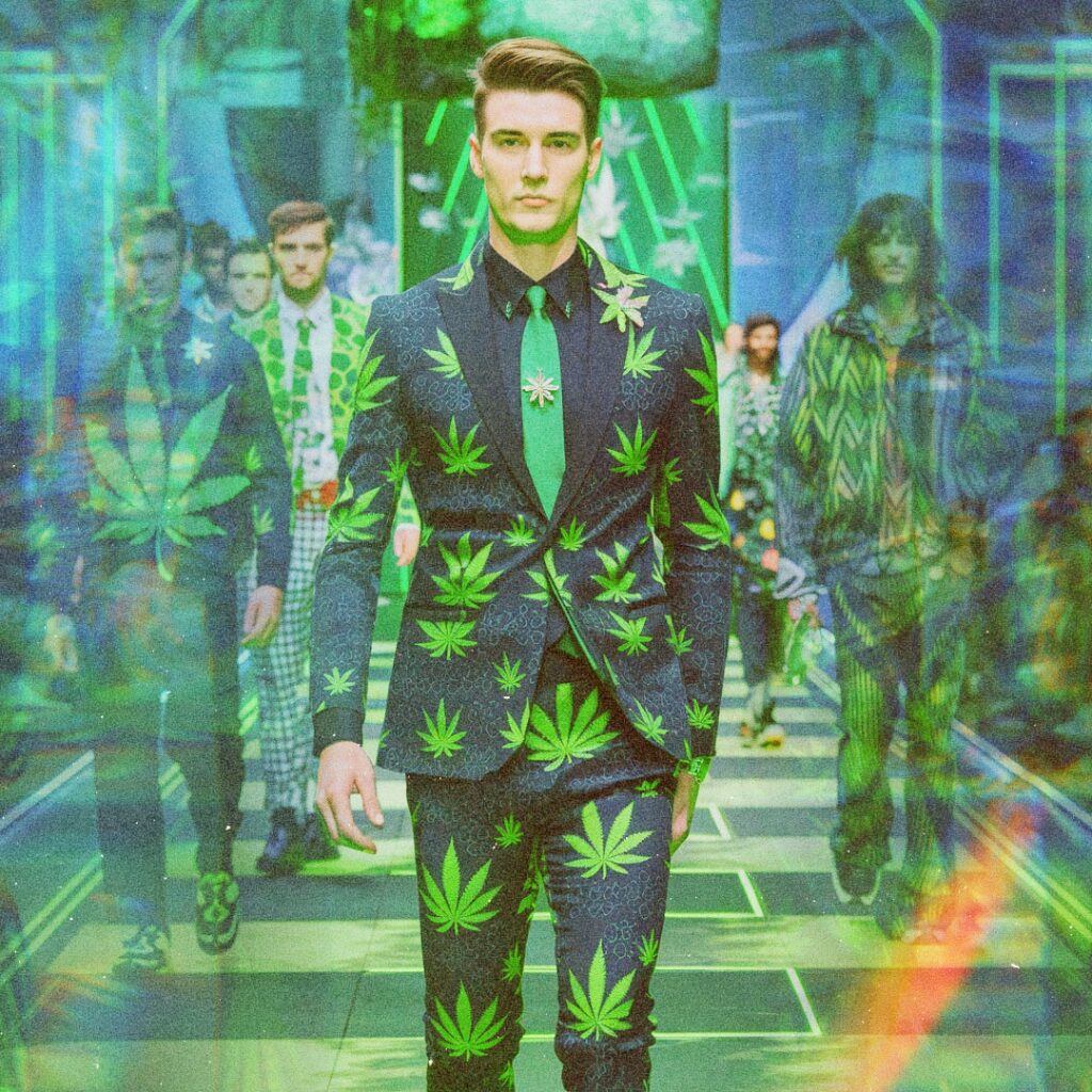
This shift is heavily influenced by other industries. Look at the branding in alcohol, beauty, or tech – these sectors have spent decades perfecting their visual identities. Cannabis brands are now taking notes, aiming for a similar level of polish and recognition. The goal isn’t to erase the plant’s identity, but to present it in a more refined and approachable way.
I'm also noticing a greater emphasis on storytelling. Logos aren’t just about visuals anymore; they're about conveying a brand’s values, its origin story, and its commitment to quality. This is a big change from the earlier days of the industry, where simply signaling 'weed' was often enough. Expect to see more logos that are evocative and symbolic, rather than literal.
Minimalism and abstract shapes
Abstract shapes are everywhere now. It isn't just a trend; it's a way for brands to look mature and discreet. If a logo doesn't scream 'stoner' at first glance, it's easier for new users to get on board.
I’ve noticed a lot of brands are ditching the literal leaf imagery in favor of abstract shapes and patterns. This allows them to create a more unique and memorable logo without relying on tired tropes. It also makes the branding more versatile – it can be applied to a wider range of products and marketing materials.
Achieving this style effectively requires a strong understanding of design principles. Color theory, typography, and negative space all play a crucial role. A well-executed minimalist logo can be incredibly impactful, even with very few elements. Here are some characteristics of this trend:
* Clean lines and simple shapes
* Limited color palettes
* Emphasis on negative space
* Subtle symbolism
Botanical illustrations
While the overt leaf is falling out of favor, botanical illustrations are gaining traction. But we're not just talking about cannabis leaves here. Brands are incorporating detailed illustrations of complementary plants, flowers, and herbs to create a more natural and sophisticated feel. This trend aligns with the growing emphasis on the wellness aspects of cannabis.
The key is accuracy and artistry. A poorly rendered botanical illustration can look cheap and amateurish. Brands are investing in skilled illustrators who can create detailed and realistic depictions of plants. This adds a layer of credibility and quality to the branding.
This approach also allows for more subtle and nuanced branding. Instead of hitting consumers over the head with "weed,’ brands can evoke a sense of natural healing and well-being. Think of a logo featuring a delicate lavender sprig alongside a cannabis flower – it"s a much more refined and sophisticated message. It's about artistry, not just slapping a leaf on something.
Minimalist Weed Logos & Analysis
- Seedling Silhouette - A simple, single-color silhouette of a sprouting cannabis seed. This works because it represents new beginnings and growth, core concepts for a brand focused on quality and cultivation. The simplicity ensures memorability and scalability.
- Leaf & Circle Combination - A clean, geometric design featuring a cannabis leaf subtly integrated within a circle. The circle represents wholeness and the cyclical nature of growth, while the leaf clearly identifies the industry. Color palettes using earthy greens and browns are effective.
- Negative Space Leaf - A logo utilizing negative space to form a cannabis leaf within a solid shape (e.g., a square or triangle). This creates a sophisticated and modern feel, appealing to a discerning customer base. The hidden leaf adds an element of discovery.
- Monogram with Leaf Accent - A logo featuring the brand's initials cleverly incorporating a small cannabis leaf element. This is ideal for brands wanting to emphasize their name recognition. A sans-serif font paired with the leaf creates a balanced aesthetic.
- Abstract Leaf Vein Pattern - An abstract representation of cannabis leaf veins, forming a unique and artistic pattern. This avoids the cliché of a full leaf while still clearly signaling the industry. Muted, natural tones enhance the sophisticated feel.
- Geometric Cannabis Flower - A logo constructed from geometric shapes to depict a cannabis flower. This modern approach conveys precision and innovation. Limited color palettes (two or three colors) are key to maintaining a minimalist look.
- Line Art Leaf & Drop - A single, continuous line drawing combining a cannabis leaf shape with a droplet. This represents purity, natural origins, and a focus on quality extracts. The simplicity of the line work makes it versatile.
Color choices beyond green
Green is the obvious choice, but it's also the most boring. I'm seeing more brands use colors that have nothing to do with the plant. They're picking palettes based on how they want a customer to feel—calm, energized, or even just curious.
Consider the emotions different colors evoke. Blue can convey trustworthiness and calmness, while orange can suggest energy and creativity. Purple is often associated with luxury and spirituality. By carefully selecting colors, brands can communicate their values and target specific demographics.
I’m seeing a lot more muted tones and earthy palettes. Think sage greens, dusty roses, and warm browns. These colors create a sense of naturalness and sophistication, which aligns with the wellness-focused branding we’re seeing emerge. Here's a quick look at some popular palettes:
| Color Palette | Feeling Evoked | Best For |
|---|---|---|
| Muted Greens & Browns | Natural, Earthy, Relaxing | Wellness Brands, Organic Products |
| Deep Blues & Grays | Trustworthy, Sophisticated, Professional | Medical Cannabis, High-End Products |
| Warm Oranges & Reds | Energetic, Creative, Social | Lifestyle Brands, Recreational Products |
Typography and brand voice
Font choice is often overlooked, but it’s a critical element of logo design. The right font can convey a brand’s personality and enhance its overall message. A poorly chosen font, on the other hand, can ruin an otherwise great design. It’s that important.
Different font families evoke different feelings. Serif fonts (like Times New Roman) tend to feel traditional and authoritative, while sans-serif fonts (like Helvetica) are more modern and minimalist. Script fonts can add a touch of elegance and personality, but they can also be difficult to read.
Consider readability and scalability. The logo needs to be legible at various sizes, from a tiny favicon to a large billboard. It’s also important to ensure you have the necessary licensing rights for the font you choose. I'm seeing a lot of brands opting for custom typography to truly stand out.
Color Psychology for Cannabis Logo Design (2026 Trends)
| Color | Associations & Emotions | Cannabis Brand Examples | Potential Risks/Considerations |
|---|---|---|---|
| Teal | Calm, relaxation, sophistication, natural wellness. Often associated with balance and healing. | Several wellness-focused CBD brands utilize teal to convey a sense of tranquility and health. | Can be perceived as clinical or cold if not balanced with warmer tones. |
| Burgundy | Luxury, premium quality, indulgence, sophistication. Evokes a sense of richness and maturity. | Brands targeting a more discerning, experienced consumer often employ burgundy. | May appear overly formal or inaccessible to some demographics. |
| Ochre | Earthy, natural, grounded, organic. Connects to the plant itself and a sense of authenticity. | Increasingly popular among brands emphasizing natural cultivation and sustainable practices. | Can sometimes appear dated or lack vibrancy if not used carefully. |
| Forest Green | Nature, growth, health, tranquility, eco-friendliness. Directly links to the plant and its origins. | Widely used across the cannabis industry, particularly by brands focused on natural products. | Risk of blending in – requires strong design elements to stand out. |
| Warm Gold | Premium, celebratory, euphoric, high-quality. Suggests a luxurious experience. | Brands aiming for a more upscale or celebratory image may use gold accents. | Can be perceived as ostentatious or overly expensive if not used subtly. |
| Dusty Rose | Calming, gentle, approachable, feminine. Offers a softer alternative to traditional cannabis aesthetics. | Emerging trend in brands targeting wellness and self-care. | May not resonate with consumers seeking a more 'traditional' cannabis experience. |
| Deep Purple | Creativity, spirituality, mystery, luxury. Evokes a sense of imagination and relaxation. | Used by brands wanting to convey a unique and artistic identity. | Can be associated with artificiality if the shade is too bright or synthetic-looking. |
Illustrative comparison based on the article research brief. Verify current pricing, limits, and product details in the official docs before relying on it.
Design software
Creating professional-quality weed logo designs requires the right tools. Industry-standard vector graphics editors like Adobe Illustrator and Affinity Designer are essential. These programs allow you to create scalable graphics that won’t lose quality when resized.
Adobe Illustrator is the industry leader, but it comes with a subscription cost. Affinity Designer is a one-time purchase and offers a comparable feature set. Both programs allow for precise control over every aspect of the design process.
If you don't want to draw everything from scratch, sites like Adobe Stock have decent assets. Just check the license before you print 10,000 boxes. Most designers I talk to still prefer building custom vectors to avoid looking like a template.
Popular Logo Design Software (as of November 2023 - based on r/graphic_design & r/logodesign discussions)
| Software | Key Features | Typical User Pain Points | Estimated Learning Curve |
|---|---|---|---|
| Adobe Illustrator | Industry standard vector graphics editor; precise control; extensive features. | Subscription cost; steep learning curve for beginners; can be resource intensive. | High |
| Affinity Designer | Professional vector graphics editor; one-time purchase; comparable features to Illustrator. | Smaller user base/fewer online tutorials than Illustrator; occasional performance issues with complex designs. | Medium-High |
| Procreate (iPad only) | Raster-based digital painting app; intuitive interface; excellent for sketching and illustrative logos. | Limited to iPad; raster-based (less scalable than vector); not ideal for text-heavy logos. | Low-Medium |
| Inkscape (Free & Open Source) | Vector graphics editor; cross-platform; no cost. | Less polished interface than commercial software; can be buggy; steeper learning curve than some alternatives. | Medium |
| Figma | Collaborative interface design tool; vector-based; strong for UI/UX but increasingly used for logo design. | Requires internet connection; can be less precise for intricate logo work than dedicated vector editors. | Medium |
| CorelDRAW | Professional vector illustration software; offers a wide range of tools and features. | Can be expensive; some users report a less intuitive interface compared to Illustrator. | Medium-High |
Illustrative comparison based on the article research brief. Verify current pricing, limits, and product details in the official docs before relying on it.

No comments yet. Be the first to share your thoughts!