
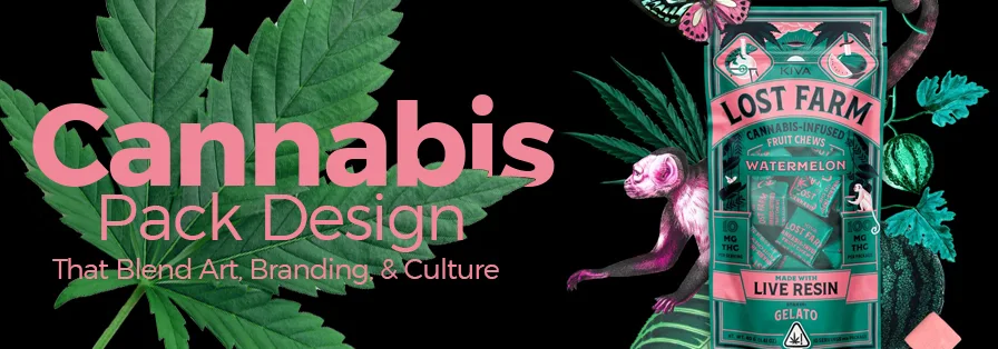
Packaging as a branding tool
Cannabis legalization is moving fast, and the rules change almost as quickly. This hits packaging hardest. You can't just slap a label on a jar to stay legal anymore; the box or bottle is often the only way to tell one brand from the next on a crowded shelf.
For a long time, cannabis packaging was purely functional – focused on security and compliance. But consumers are getting more sophisticated. They’re looking for brands that align with their values and offer a premium experience. Packaging is the first physical touchpoint a customer has with your brand, and it's a chance to make a lasting impression. It’s about storytelling, differentiation, and building trust.
We’ve seen a real move away from generic, utilitarian packaging towards designs that reflect the product’s quality and the brand’s identity. This includes everything from the materials used to the overall aesthetic and the information presented. It's about recognizing that consumers aren't just buying a product; they're buying into a lifestyle and an experience.
The competition is also intensifying. As more brands enter the market, standing out on the shelf – or online – becomes increasingly difficult. Creative and compliant packaging is a key way to cut through the noise and attract the attention of discerning customers. Ignoring this is a risk; a missed opportunity to connect with your audience.
Missouri's 2025 packaging rules
Missouri’s regulations surrounding cannabis packaging are comprehensive, and understanding them is essential for any business operating within the state. The Missouri Department of Health & Senior Services’ Marijuana Packaging, Labeling, and Product Design Guide (April 2025) lays out a detailed framework for compliance. They're very clear about prioritizing public health and preventing access to minors.
Section 4 of the Missouri guide requires opaque packaging. You can't use clear glass or translucent plastic. Everything must also be child-resistant, following the federal 16 CFR § 1700 standards. Missouri doesn't make suggestions here; these are hard requirements to keep products away from kids.
Labeling requirements are extensive. Section 3 of the guide details the information that must be included on every package: a universal symbol indicating the product contains THC, a warning statement about the risks of cannabis consumption, the potency of the product (THC and CBD content), a complete list of ingredients, and the manufacturer’s or distributor’s information. These labels must be clearly legible and prominently displayed.
Perhaps most critically, the guide outlines stringent prohibitions against designs and shapes that could appeal to children. This includes, but isn't limited to, packaging resembling candy, cartoon characters, or anything that might be attractive to someone under the legal age. Missouri is taking a very proactive stance on preventing youth access, and the regulations reflect that. It's a high bar, and brands need to be meticulous in their design choices.
The guide also addresses requirements for unit packaging, primary packaging, and secondary packaging, each with its own specific rules. For example, pre-packaged flower must be sealed in a container that prevents tampering and maintains freshness. It’s a lot to navigate, but thorough understanding of the April 2025 guide is the first step to compliance.
Design elements that get rejected
The Missouri Department of Health’s guidelines on prohibited designs aren’t just about avoiding obvious imagery. They're about a broader principle: preventing any element that could reasonably be seen as appealing to children. This is where things get tricky, because "appeal" is subjective. Section 4 of the guide provides examples, but it also requires a degree of interpretation.
Specifically, the guide prohibits packaging that resembles human or animal figures, especially if those figures are cartoonish or animated. Bright, vibrant colors often associated with children’s products – think primary colors and pastel shades – are also discouraged. Shapes that mimic popular candies or snacks are a definite no-go. Even fonts can be problematic; overly playful or whimsical typography should be avoided.
The reasoning behind these prohibitions is clear: to minimize the risk of accidental ingestion by children. However, it presents a design challenge. How do you create packaging that stands out and attracts adult consumers without inadvertently appealing to a younger audience? It requires careful consideration of color palettes, imagery, and overall aesthetic.
Here’s a quick checklist of things to avoid: cartoon characters, brightly colored illustrations, shapes resembling food items, playful fonts, and anything with a generally "youthful" vibe. It's also important to consider cultural context. What might be innocuous in one culture could be appealing to children in another. It's a complex issue, and erring on the side of caution is always the best approach.
- Avoid cartoon characters or animated figures.
- Steer clear of bright, primary colors and pastels.
- Don't use shapes resembling candies or snacks.
- Use clean, adult-focused typography instead of bubbly or hand-drawn scripts.
- Ensure imagery doesn't have a 'youthful' vibe.
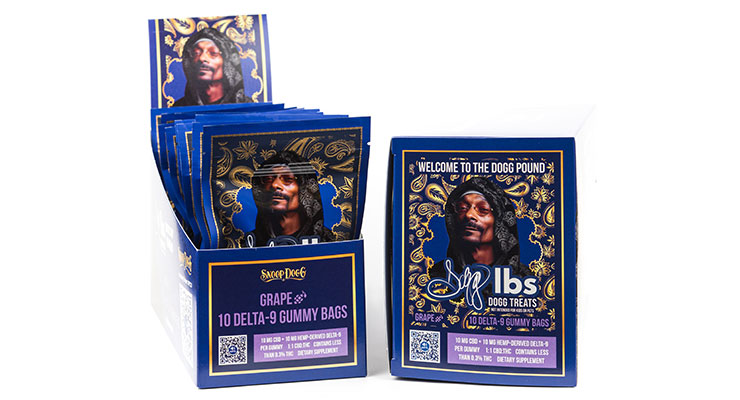
Branding in a Box: Creative Solutions
While Missouri’s regulations are strict, they don’t eliminate the possibility of creative branding. In fact, the constraints can force designers to think outside the box and develop innovative solutions. The key is to find ways to express your brand’s personality within the legal framework.
Material choices are a good starting point. Moving beyond standard cardboard boxes and exploring options like textured paper, metallic finishes, or even sustainable materials can elevate the packaging and communicate a sense of quality. Consider using recycled or compostable materials to appeal to environmentally conscious consumers. Custom boxes, even simple ones, can make a huge difference.
Box structures also offer opportunities for differentiation. Unique shapes, interesting closures, and thoughtful interior designs can create a memorable unboxing experience. Think about how the packaging feels in the hand – the weight, the texture, the overall tactile experience. These details matter.
Labeling techniques can also play a role. Embossing, debossing, foil stamping, and spot UV coating can add a touch of sophistication and visual interest. But remember to prioritize clarity and legibility; all required information must be easily readable. It's a balancing act between aesthetics and compliance.
Ultimately, the goal is to create a cohesive brand experience that extends from the product itself to the packaging. The packaging should feel like a natural extension of the brand’s identity, reinforcing its values and personality. Think about how the packaging will be displayed in a dispensary and how it will look in a customer’s hands.
Dispensary Branding: The Full Experience
Cannabis packaging doesn’t exist in a vacuum. It’s part of a larger dispensary branding strategy. A successful dispensary creates a consistent and immersive experience for its customers, and packaging plays a crucial role in that. It needs to align with the store’s aesthetic, target audience, and overall brand messaging.
Consider the dispensary’s interior design. Is it modern and minimalist, or rustic and natural? The packaging should complement that aesthetic. The colors, materials, and typography used on the packaging should be consistent with the store’s branding. A cohesive look and feel builds brand recognition and trust.
Think about the target audience. Is the dispensary catering to medical patients, recreational users, or both? The packaging should reflect the needs and preferences of that audience. For example, medical patients might appreciate packaging that is discreet and easy to open, while recreational users might be drawn to more visually appealing designs.
Trulieve uses a minimalist look that stays consistent from their storefronts to their jars. Curaleaf takes a different route, using heavier materials and metallic accents to feel more high-end. Both brands treat the box as part of the store's physical environment.
It’s important to remember that packaging is just one piece of the puzzle. It needs to be integrated with the store’s overall branding, marketing, and customer service efforts. A strong brand identity creates a loyal customer base and sets a dispensary apart from the competition.
Material Matters: Sustainability & Cost
The choice of packaging material is a significant decision, impacting both cost and brand perception. Traditional options like plastic and glass are still widely used, but there's a growing demand for more sustainable alternatives. Each material has its own pros and cons.
Plastic is relatively inexpensive and lightweight, but it's also environmentally problematic. While recyclable in some areas, much of it ends up in landfills. Glass is more sustainable, but it's heavier and more fragile, increasing shipping costs. Metal, like aluminum, is highly recyclable but can be more expensive than plastic.
Paper-based packaging, particularly recycled paperboard, is a popular sustainable option. It's lightweight, compostable, and relatively inexpensive. However, it may not provide the same level of protection as plastic or glass. Compostable bioplastics are another emerging option, but they often require specific composting facilities to break down properly.
Cost is a major factor. Plastic is generally the cheapest option, followed by paperboard, then metal and glass. Sustainable materials often come with a premium price tag. However, consumers are increasingly willing to pay more for eco-friendly products, so investing in sustainable packaging can be a worthwhile investment.
Here's a rough comparative cost overview (costs will vary significantly based on quantity and customization): Plastic ($0.10 - $0.30 per unit), Paperboard ($0.20 - $0.50 per unit), Glass ($0.50 - $1.50 per unit), Metal ($0.75 - $2.00+ per unit), Compostable Bioplastics ($0.40 - $1.00+ per unit).
Cannabis Packaging Material Comparison - 2026 Outlook
| Material | Cost | Sustainability | Durability | Brand Perception | Child Resistance |
|---|---|---|---|---|---|
| Plastic | Low to Medium | Low | High | Generally Neutral | Medium - requires specific closures |
| Glass | Medium to High | Medium - recyclable, but energy intensive to produce | High | Premium, Sophisticated | High - when combined with appropriate closures |
| Metal | Medium to High | High - readily recyclable | High | Modern, Industrial | Medium to High - depending on closure design |
| Paper | Low | Medium to High - depending on sourcing and coatings | Low to Medium | Natural, Eco-Friendly | Low - requires additional child-resistant features |
| Compostable | Medium to High | High - if properly composted | Low to Medium | Eco-Conscious, Sustainable | Low - requires robust design and often supplementary packaging |
Illustrative comparison based on the article research brief. Verify current pricing, limits, and product details in the official docs before relying on it.
Looking Ahead: Trends for 2026
The future of cannabis packaging design is likely to be shaped by several key trends. Personalized packaging, tailored to individual consumers, is one emerging possibility. This could involve customized labels, QR codes linking to personalized product information, or even packaging that changes color based on the product’s potency.
Interactive packaging is another trend to watch. QR codes are already being used to provide consumers with access to product information, loyalty programs, and educational content. Augmented reality (AR) could also play a role, allowing consumers to scan packaging with their smartphones to unlock interactive experiences.
Sustainable materials will become even more important as consumers become more environmentally conscious. We can expect to see increased use of compostable bioplastics, recycled materials, and innovative packaging solutions that minimize waste. Regulations may also push this forward.
Changing regulations will undoubtedly impact packaging design. As more states legalize cannabis, we may see increased harmonization of packaging requirements. There’s also a possibility of stricter regulations on child-resistant packaging and advertising. Keeping abreast of these changes is crucial.
Finally, we’re likely to see a greater emphasis on tamper-evident packaging to ensure product safety and authenticity. This could involve the use of holographic seals, serialized labels, or other security features. Ultimately, the future of cannabis packaging will be defined by a combination of innovation, sustainability, and compliance.


No comments yet. Be the first to share your thoughts!